
What Do Your Logo Colours Say About Your Business?
February 10, 2021
By Sun City Signs, Thursday, February 11, 2021 7:14 AM
🍎 Red
Red tends to capture attention fast. This colour evokes a very intense emotional reaction, which includes energy, passion, action and danger.
Hence, it's not surprising red is widely used in call to actions (CTA). It's an active colour that calls for
immediate action
.
🍊 Orange
Though bright, it isn't as loud as red. Orange is often associated with creativity, fun and adventure. There's a certain degree of playfulness to it. One of the more famous brands associated with orange is Nickelodeon. It's interesting to note here too that there are fintech companies, for example, ING's digital bank, which use orange.
Perhaps it marks a departure from the more serious look and feel of traditional banks.
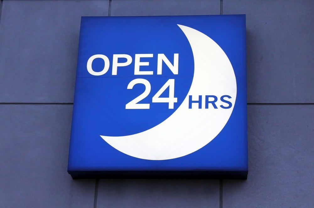
📘 Blue
The world's leading cloud-based accounting software, XERO, has blue as its main colour. As a pioneer and leading player in cloud-based accounting, gaining the trust of customers and prospects is critical.
Blue is the colour of trust. It's associated with stability and calmness just like the clear blue sky. Shades of blue are now used by tech companies like Facebook and Twitter. After all, there's a lot of trust to be nurtured in the online space!
☁️ White
Ever heard of white space in web design or content?
From a cultural point of view, white, like black, can be polarising. For example, in some cultures and religions, white symbolises death, just like black.
But from a marketing perspective, white spaces are uncluttered and succinct and promote humility. At a time when the world of business, especially the online space, is increasingly a sea of junk, the use of white is a refreshing change.
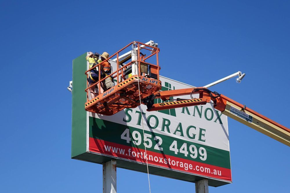
🍏 Green
With growing attention paid to climate issues, more businesses are inclined to be associated with it. Green carries an array of positive meanings, for example, growth, nature and yes, money. Brands in the agriculture sector, or any which are associated with it, tend to use green.
☎️ Get In Touch
We've examined some of the more common colours used by brands, but there are many others. Whichever you choose, it's important to discern the message you intend to communicate. To learn more about the use of colours, connect with us today.
Enhance your business visibility with effective signage solutions. Boost brand awareness and attract more customers. Learn how today!
Discover the latest signage trends for 2024. Stay ahead in the industry by exploring new and exciting innovations. Read more now.
Discover the practical Sign Maintenance Benefits for your business. Keep your signage looking fresh and professional. Learn more today!

Elevate your brand with custom signage in a competitive city. Explore the power of professional signage for business growth.

Elevate your business with custom signage. Discover how our signs enhance brand identity. Stand out and attract customers. Read on!

Discover the power of custom signs in Mackay! Stand out with bespoke signage solutions for your business. Explore our range now!

Enhance your new business with top signage tips. Elevate visibility with expert guidance on effective Business Signs. Boost your brand today!

Boost your business with effective vehicle signage. Learn six key reasons how it can benefit you. Drive visibility and growth today!

Elevate your brand with Custom Signs in Mackay. Explore the profound impact of bespoke signage on your business identity and visibility. Read on!
In this blog, we'll explore how custom signage can transform your brand identity, elevating your business and identify the key elements that make it effective.


